CSS for HTML interface: Filling the browser window
When using HTML 5 as the application interface, I want to fine-tune the interface for the browser window.
On the contrary, when it comes to a web page, if the interface is smooth, its width corresponds to the current width of the browser, but may exceed the length of the window.
In the case of an application, the browser should be confused with it: they do only one thing. Thus, when the user expands the browser window, he does this to increase the area of the application, so it must correspond in width and height to the new dimensions of the browser.
The application typically has fixed height elements, such as a toolbar and other components, and containers with different sizes, so they must change depending on the size of the browser, while others remain non-removable.
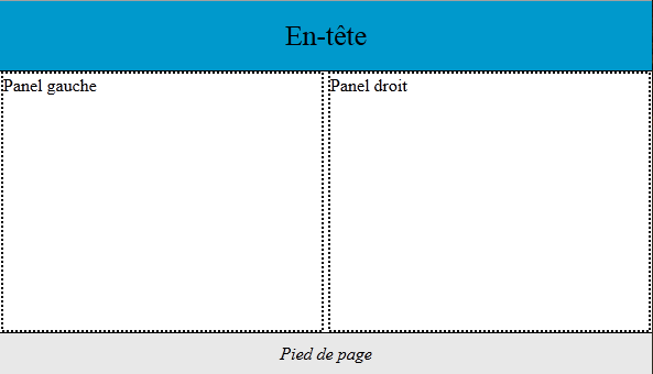
Click an image to show
In our example, the Left Panel and Right Panel layers differ in width and height depending on the size of the window. Headers and footers have a fixed position and a fixed height. Only their width corresponds to the width of the browser window.
We make such an interface with a specially studied style sheet and check for a demo that you can resize the window at will, the application always occupies the entire surface.
HTML-code
<!DOCTYPE html>
<html>
<head>
  <meta charset="utf-8">
  <title>HTML 5 Interface Demo </title>
</head>
<body>
  <div id="container">
    <div id="outer">
      <div id="header">En-tête</div>
      <div id="inner">
        <div id="lpane">Panel gauche</div>
        <div id="rpane">Panel droit</div>
      </div>
    </div>
    <div id="footer">Pied de page</div>
  </div>
</body>
</html>
Container tag contains out and footer. The outer tag contains a header and inner. The innate layer is divided into two adjacent panels. The width and height of both panels depend on the window size .
CSS code
div
{
  -webkit-box-sizing: border-box;
  -moz-box-sizing: border-box;
  box-sizing: border-box;
}
#container
{
  position:absolute;
  top:0;
  left:0;
  height:100%;
  width:100%;

  padding-bottom:40px;
  overflow:hidden;
}
#header
{
  width:100%;
  height:64px;
}
#outer
{
  margin:0px auto;
  width:100%;
  height:100%;
}
#inner
{
  margin:0px;
  min-width:480px;
  height:100%;
  background:white;
  padding:0 0 64px 0;
  text-align:center;
}
#lpane, #rpane
{
  display:inline-block;
  width:49.5%;
  height:100%;
  margin:0px;
  min-width:120px;
  background:white;
  overflow:hidden;
  text-align:left;
}
#footer
{
  height:40px;

}
The box-sizing: border-box property applies to all layers in the document. This avoids increasing the size of the layers by the inner margins. This facilitates dimension management.
# container in absolute position. This is important because it determines the behavior of all inner layers.
# footer is included in # container. Since padding-bottom has 40 pixels, this limits the height of the first content item (# outer) and leaves room for the second item, which is always visible at the bottom of the page.
# header has a fixed height and variable width.
# outer and # iner divide the page by height, these are purely layout layers and they have no pure content.
# outer has 100% height, but it is offset 64 pixels by the header, and also overlaps the footer. To avoid this, he is credited with lower padding at 64px.
# lpane and # rpane correspond to two panels separating the content. 49.5% width and display mode: inline-block allow you to align them side by side. Be careful, just change the margins to lose that alignment. If you want to create fields, they will also be assigned to the elements contained in them. Similarly, if you want to scroll through their contents, you will add an inner layer with the overflow: auto property.
Demo license and style sheet: Creative Common. You can use the demo for your own apps (think de-tagging meta robots) or for offline learning. Don't use it for an online tutorial.