flex-based page template
Flex is an added CSS property that allows you to receive pages that are automatically adapted to different screens.
This is the value of the display attribute. Therefore, CSS simply added an additional value to the existing property:
- displaying: none: Hidden Feature .
- displaying: inherit: Same format as container.
- screen: inline: Displayed as a result of the previous one without returning to the line.
- displaying: block: feature placed on new row with dimension and field attributes .
- Display: inline-block: A block that can be mapped to the previous block if it is less wide than the container.
- diplay: list-item: As a line in a list with a chip .
- screen: flex: Flexible display of container contents .
After you select flex, you can add other properties to the container.
- flex direction: column | row
Display items in columns or rows (default). - flex-wrap: wrap | nowrap (default).
- Wrap makes us go to the line when the elements overflow.
- Nowrap places all elements on the same line, reducing their width if necessary.
- justify-content: center | flex-start (по умолчанию) | flex-end | space-around | space-between
- Center shows elements near the center of the line.
- flex-start justifies them on the left.
- flex-end justifies them on the right.
- space-around places them at regular intervals, putting them on the line.
- space-between aligns content to the left and right, or to the top and bottom, placing space between elements.
Different properties are also added for contained elements. In particular, flex-shrink, which indicates whether an element can be reduced or not to free up space. flex-shrink: 0 means it cannot be shrunk.
Therefore, we want to use these new properties to make the web page template adaptable and use a minimum of CSS code.
To do this, you need to split the page into several sections:
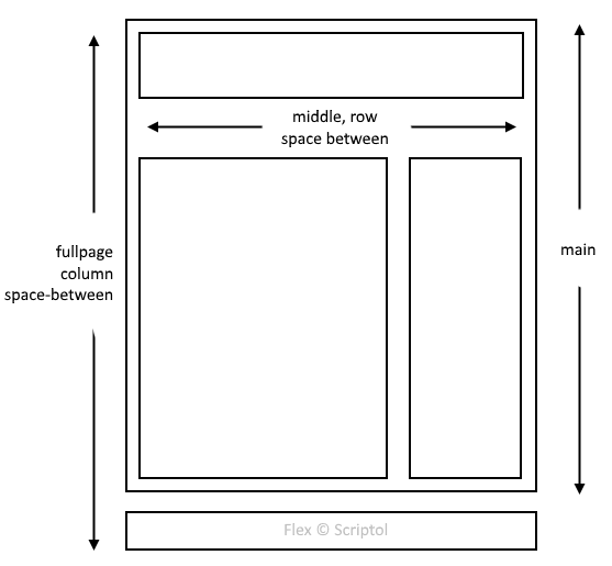
- Fullpage is the main container, its two elements are aligned with columns .
- The first element, the hand, and the second, the footer, are separated by variable space depending on the content of the page. Footer, the footer is always at the bottom of the window, even if the page is almost empty.
- Main contains two elements: Header and middle.
- Header at set height, middle variable height.
- The middle contains two elements (default, therefore not specified). They are separated by variable space depending on the content.
- The first element, content, has a variable width and is placed on the left. The second, sidebar, on the right has a fixed width.
This leads to the following scheme:
CSS code is greatly simplified:
<style>
html, body: {
  margin:0;
  padding:0;
}

#fullpage {
  display:flex;
  flex-direction:column;
  justify-content:space-between;
  margin:0;
  position:absolute;
  top:0;
  bottom:0;
  left:0;
  right:0;
}

#middle {
  display:flex;
  justify-content:space-between;
}

#header {
  height:100px;
}

#content {
  padding:32px;
}

#sidebar {
  width:200px;
}

#footer {
  min-height:64px;
  display:flex;
  flex-direction:column;
  justify-content:center;
}
</style>
Removed from the demo code what is not used at the disposal of the elements. The full code is on the demo page.
If you want to limit the maximum page width, you can add these two lines to the # fullpage property:
max-width:1280px;
margin:auto;It can be downloaded and used as a starting point for a site or application.
The flex value for the display is supported by all recent browsers. If you want to maximize your audience, you should stay in classic CSS, here is the page template for all old browsers.