Circle, arc and circle graph with Canvas and JavaScript
Algorithm for drawing a pie graph with inscriptions, HTML 5 operator and a little trigonometry...
To draw a simple circle, the Kanvas method is used with a length of 2 * PI.
<script>
function circle()
{
  var canvas = document.getElementById("canvas1");
  var context = canvas.getContext("2d");
  context.beginPath();
  context.lineWidth="2";
  context.arc(100, 100, 90, 0, 2 * Math.PI);
  context.stroke();
}
circle();
</script>
The size of the channel is 200 x 200 pixels. The center of the circle at x = 100, y = 100 is given by the arguments x and y of the arc function.
A radius of 90 pixels is the third argument. The third and fourth arguments give the starting angle, 0 and the final angle, twice PI.
You can ignore the argument that the meaning of rotation is superfluous here.
Circle can be filled by fill method
The fill command is added to the previous code to fill the circle, but the fillStyle attribute is also assigned to determine the color.
The Stroke element can be saved to add a boundary or skipped only for a colored circle.
Just as the fillRect method was created to draw a full rectangle, the fillCircle function is defined to get a full circle.
function fillCircle()
{
  var canvas = document.getElementById("canvas2");
  var context = canvas.getContext("2d");
  context.beginPath();
  context.fillStyle="#FF4422"
  context.arc(80, 80, 70, 0, 2 * Math.PI);
  context.fill();
}
fillCircle();
Create Pie Chart
A graph is created consisting of circular sectors or "pie shares," creating these sectors using the arc, lineTo and fill methods.
- To share a graph, the values to be assigned to the sectors, each arc will be proportional to the statistical value shown and as a percentage of PI * 2, which is the circle of the circle.
- Each pie part corresponds to an arc whose position is from the end of the previous arc to a new position corresponding to PI * 2 * value/sum.
The arc is drawn using the arc function (it is not drawn entirely at the beginning). - An amendment should be added so that the first part is at the top, for which it is necessary to draw a conclusion PI/2 that corresponds to a quarter of a circle.
- We see the radius from the center to the last position. Like the arc, it will actually be invisible on the graph because it has the same color as the sector.
In fact, since we just drew an arc, the moveTo function is useless, it is enough to continue the contour going from the circle to the center of the circle using the lineTo method . - We fill the area of the color assigned to it using the fillet method. Sequential colors are selected from a predefined indexed list.
Example:
Source code
function pie(ctx, w, h, datalist)
{
  var radius = h / 2 - 5;
  var centerx = w / 2;
  var centery = h / 2;
  var total = 0;
  for(x=0; x < datalist.length; x++) { total += datalist[x]; };
  var lastend=0;
  var offset = Math.PI / 2;
  for(x=0; x < datalist.length; x++)
  {
    var thispart = datalist[x];
    ctx.beginPath();
    ctx.fillStyle = colist[x];
    ctx.moveTo(centerx,centery);
    var arcsector = Math.PI * (2 * thispart / total);
    ctx.arc(centerx, centery, radius, lastend - offset, lastend + arcsector - offset, false);
    ctx.lineTo(centerx, centery);
    ctx.fill();
    ctx.closePath();
    lastend += arcsector;
  }
}

var datalist= new Array(35, 25, 20, 12, 7, 1);
var colist = new Array('blue', 'red', 'green', 'orange', 'gray', 'yellow');
var canvas = document.getElementById("canvas3");
var ctx = canvas.getContext('2d');
pie(ctx, canvas.width, canvas.height, datalist);
The values are in the datalist table and the colors are in colist. These two tables are displayed in the pie () function to create consecutive sectors according to consecutive values and colors. Note: Do not use the function for (x in the table), it does not work.
You can flatten the graph to create a 3D effect with a scaling function, see the article on the ellipse.
The code has been tested with all browsers that support Canvas.
Circular Plot Labels
The display of symbols next to the graph with corresponding values is not as significant as if they were placed on the graph.
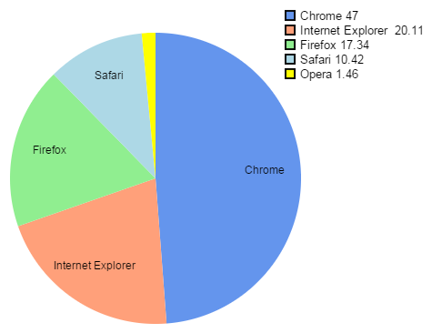
Example: Market shares of browsers in May 2015 according to StatCounter.
With small trigonometry, these formulations can be placed in the center of each part of the graph. Except when the quarters are too small, it becomes unreadable, so we just skip words.
Source code
function pie(ctx, w, h)
{
  var radius = h * 2 - 5;
  var centerx = w / 2;
  var centery = h / 2;
  var lastend = 0;

  var offset = Math.PI / 2;
  var labelxy = new Array();

  var fontSize = Math.floor(canvas.height / 33);
  ctx.textAlign = 'center';
  ctx.font = fontSize + "px Arial";
  var total = 0;
  for(x=0; x < datalist.length; x++) { total += datalist[x]; };

  for(x=0; x < datalist.length; x++)
  {
    var thispart = datalist[x];
    ctx.beginPath();
    ctx.fillStyle = colist[x];
    ctx.moveTo(centerx,centery);
    var arcsector = Math.PI * (2 * thispart / total);
    ctx.arc(centerx, centery, radius, lastend - offset, lastend + arcsector - offset, false);
    ctx.lineTo(centerx, centery);
    ctx.fill();
    ctx.closePath();
    if(thispart > (total / 20))
       labelxy.push(lastend + arcsector / 2 + Math.PI + offset);
    lastend += arcsector;
  }

  var lradius = radius * 3 / 4;
  ctx.strokeStyle = "rgb(0,0,0)";
  ctx.fillStyle = "rgb(0,0,0)";
  for(i=0; i < labelxy.length; i++)
  {
    var langle = labelxy[i];
    var dx = centerx + lradius * Math.cos(langle);
    var dy = centery + lradius * Math.sin(langle);
    ctx.fillText(datalist[i], dx, dy);
  }
}
On a ajouté le tableau labelxy pour stocker la position de chaque libellé qui est calculée lors du dessin du graphe. Le texte est placé après car il peut déborder d'un secteur.
Lorsque une portion du graphe - donc un pourcentage statistique - est inférieure à 1/20 ème de la distribution totale, le libellé n'est pas placé sur le graphe pour éviter un entassement de texte qui deviendrait illisible. En fait, si un graphe en tarte à de trop nombreux quartiers, alors les pourcentages seraient mieux représentés sur un graphe en barres. Un autre chapitre à ajouter à ce tutoriel...
Une démonstration de ces algorithmes est donnée par le générateur de graphe circulaire en ligne disponible sur ce site.